
Tattoo Ink Blog - How to Tattoo Realistic Chrome and Metallic Textures: The Science of High-Contrast Realism
Chrome is a chemical lie; your eyes are merely being tricked by the most violent contrast the human skin can sustain. You've likely felt the frustration when a metallic piece heals looking like dull, grey stone rather than polished steel. It's a common struggle where white highlights seem to vanish within 180 days and the shallow depth of your blacks fails to provide that essential specular reflection. Mastering how to tattoo realistic chrome and metallic textures requires moving beyond basic shading and into the realm of high-performance pigment science.
We're here to bridge the gap between your artistic vision and the technical rigor of ink chemistry. This guide promises to reveal the exact shading strategies and pigment selection protocols needed to create liquid-metal effects that retain their sharpness for decades. We'll explore the physics of light, the necessity of high-dispersion carbon blacks, and the precise application techniques that transform a flat surface into a mirror-like masterpiece that defines your professional legacy.
Key Takeaways
- Realize that metallic realism is an optical illusion built on the physics of specular reflection, requiring you to manipulate light and shadow with surgical precision.
- Discover why high-saturation pigments like Zuper Black are the essential foundation for creating the deep voids that make chrome effects pop off the skin.
- Master how to tattoo realistic chrome and metallic textures by utilizing the "Black Anchor" technique to establish maximum contrast early in the session.
- Learn to map complex reflections into simplified value shapes and horizon lines to maintain clarity and prevent the piece from looking flat.
- Understand the chemical factors that influence pigment migration so you can choose high-load inks that preserve your sharpest highlights for a lifetime.
The Physics of Reflection: Why Chrome Isn't Gray
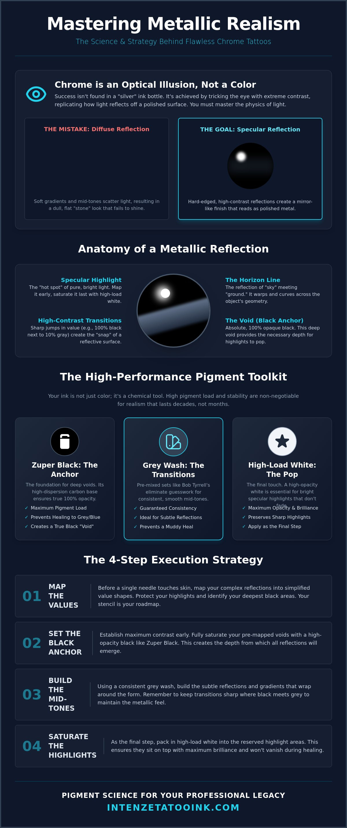
Chrome is an optical deception. It isn't a pigment; it's a mirror. To master how to tattoo realistic chrome and metallic textures, you must abandon the search for a "silver" bottle. The history of tattooing shows us that depth comes from contrast, not shortcuts. While diffuse reflection scatters light in every direction, creating a matte look, specular reflection bounces light back with surgical precision. This is why chrome looks like liquid. It reflects the world around it with almost zero light loss. Success depends on your ability to replicate this behavior using only the most extreme ends of the value scale.
The horizon line is your most powerful anchor. In roughly 85% of chrome studies, the illusion fails because the artist ignores how the ground meets the sky on a curved surface. This line is rarely straight. It curves, warps, and breaks according to the geometry of the object. If you're tattooing a chrome sphere, that horizon line might encompass 60% of the object's surface area. You aren't just shading; you're building a landscape within a reflection. You don't need a massive palette for this. You need a 10:1 ratio of absolute black to pure white, using grays only as the connective tissue that defines the edges of the reflection.
Specular Highlights and the Power of Negative Space
Specular highlights are the "hot spots" where light hits the surface at a perfect angle. These aren't just white dots. They're the highest peaks of your value scale. You must protect these areas from the very start. Map them out before your first pass. While some artists rely on negative space, the liquid-metal look often demands the punch of a high-load white pigment to truly stand out against the surrounding blacks. These highlights should be the last thing you saturate, ensuring they sit on top of the skin with maximum brilliance.
High-Contrast Transitions: The Secret to 'Liquid' Metal
Soft gradients are the enemy of metal. If your transitions are too smooth, the object will look like a cloud or a piece of soft stone. Metal requires hard edges. You're looking for sharp value jumps where a 100% black sits directly next to a 10% gray. This creates the "snap" that the human brain interprets as a reflective surface. When you visualize the distortion on a curved metallic object, remember that the reflection compresses at the edges. This compression increases the frequency of these high-contrast jumps, making the object feel solid, heavy, and undeniably realistic.
The Professional Toolkit: Selecting High-Saturation Inks
Your choice of pigment is the difference between a legacy piece and a muddy mess. To understand how to tattoo realistic chrome and metallic textures, you have to treat your ink cap like a laboratory. You aren't just looking for "dark" or "light" tones. You're looking for specific pigment loads that can withstand the body's natural defense mechanisms for 20 years or more. High-contrast realism lives and dies by the chemical purity of your blacks and the opacity of your whites. If your ink lacks the necessary dispersion, your sharp edges will blur within the first 12 months of healing.
The foundation of any metallic piece is the "void." This is the absolute black that provides the depth for the surrounding reflections. When you apply The Law of Reflection to skin art, you realize that the darker the darks, the brighter the highlights appear to be. This isn't just an artistic choice; it's a physiological one. Equipping your station with the industry standard in pigment science ensures your work stands the test of time and maintains that liquid-metal snap.
Zuper Black: Achieving 100% Opacity in Dark Values
Carbon-based pigments are the backbone of metallic realism. Zuper Black is engineered with a massive pigment load to ensure 100% opacity in a single pass. Many artists fail because they use "watered down" lining blacks that eventually shift toward blue or green as the macrophages in the skin interact with the particles. You need a stable, high-dispersion carbon that creates a true black hole on the skin. This provides the necessary "anchor" for the chrome effect to function.
Bob Tyrrell Grey Wash: Precision for Subtle Reflections
Consistency is the enemy of muddiness. Using a pre-mixed scale, like the Bob Tyrrell 4-bottle set, eliminates the guesswork of manual dilution. These washes are designed for ghostly, smooth transitions that mimic how light wraps around steel or polished brass. While chrome requires hard edges, the subtle reflections within the metal need these precise mid-tones to feel three-dimensional. A consistent shading scale prevents the values from "bleeding" into one another during the healing process, keeping your reflections crisp and intentional. Using a dedicated set ensures that your light-to-dark ratios remain mathematically perfect across the entire tattoo.
Finally, your white ink must be the most stubborn tool in your kit. It needs a high titanium dioxide concentration to remain visible over the years. These final glints are what sell the "liquid" look. Without a lightfast, opaque white, your chrome will eventually fade into a standard black and gray portrait. Choose pigments that are REACH compliant and ISO certified to ensure that your artistic revolution is backed by the highest safety standards in the world.
Mapping the Metallic Surface: Stencil and Value Strategy
A reference photo is a chaotic mess of visual data. To understand how to tattoo realistic chrome and metallic textures, you must translate that chaos into a manageable topography of values. You aren't tattooing "metal." You're tattooing a series of interlocking, high-contrast shapes. Each shape represents a specific light value that must be captured with surgical precision. By simplifying the complexity of a reflection into distinct "value shapes," you prevent the piece from becoming a muddy disaster. This strategic approach is also a matter of Tattoo Safety and long-term clarity. Over-working the skin to find your values mid-session leads to excessive trauma and poor healing results.
The "Black Anchor" technique is your North Star in this process. Start by saturating your absolute darkest points using a high-load carbon pigment. Once these "voids" are established, you have a fixed point of reference for every other shade on the scale. Avoid the urge to over-blend your transitions. In chrome, a soft gradient often reads as dirt or oxidation rather than polished steel. If you want that liquid-metal snap, you must keep your edges crisp. Use a dedicated Color Lining Solution to maintain the integrity of these high-contrast zones. It prevents the black from bleeding into your light-wash areas; this ensures the transition remains sharp enough to trick the eye into seeing a reflection.
Building the Stencil for Chrome
A standard outline won't suffice for high-contrast realism. You need a blueprint that differentiates between hard reflection edges and softer, ambient gradients. Mark these boundaries clearly on your stencil design. Many elite artists use a dual-marker system: blue for the "Black Anchor" zones and red for the "Hot Spot" highlights. This visual shorthand allows you to focus on the technical application rather than second-guessing your reference 4 hours into the session. Mapping the light source before the needle touches the skin is the only way to ensure the reflection follows a logical, three-dimensional path.
The Layering Process: From Void to Highlight
Working from dark to light is the gold standard for metallic realism. This sequence protects your light-wash areas and negative space from accidental pigment contamination. If you pack your whites or light grays first, you risk dragging dark carbon particles into those clean zones during subsequent passes. Managing skin trauma is equally critical. You want the skin to remain receptive for that final white highlight. If the area is over-worked, the white will bounce or heal out. Aim for a single, saturated pass in your dark zones so the skin stays calm enough to accept the glints that define the final piece and secure your artistic legacy.
Step-by-Step Execution: Creating the 'Liquid' Effect
Execution is where theory meets the needle. To achieve the "liquid" look, you must work with a sense of deliberate speed and absolute confidence. You've already mapped your values; now you must execute them without hesitation. Mastering how to tattoo realistic chrome and metallic textures is a process of building layers that trick the brain into perceiving a three-dimensional, reflective surface on a two-dimensional plane. This requires a technical discipline that prioritizes high-contrast jumps over soft, traditional blending. Every pass must be intentional, ensuring that your blacks remain deep and your highlights stay pure.
- Step 1: Saturate the 'Black Voids': Use Zuper Black to pack your darkest areas. These "black holes" are the foundation of the reflection. Without 100% saturation here, the chrome will lack the necessary weight to look real.
- Step 2: Establish the Horizon Line: Use mid-tone gray washes to define where the "sky" meets the "ground" in the reflection. This line is the anchor for the viewer's perspective.
- Step 3: Implement Whip Shading: For brushed metal or textured steel, use a fast hand speed and a low voltage to create micro-textures. This adds a sense of "grain" to the metallic surface.
- Step 4: The 'Power Highlight': Apply Gen-Z White for the final specular glints. This is the most critical step; it provides the "snap" that defines the light source.
- Step 5: Cleanse and Evaluate: Use Intenze Cleanze to remove excess pigment and reduce redness. This allows you to check for true saturation and ensure no "holidays" exist in your black voids.
Equip your studio with professional-grade Intenze pigments to ensure your metallic work never fades into the background.
Mastering the 'Hard Edge' Blend
In chrome realism, the transition from 100% black to 0% skin tone often happens in less than 2mm of space. This isn't a soft gradient; it's a collision of values. Use a tight round liner for these sharp reflection details to maintain the "cut" of the light. For subtle metallic grain, the "dry brush" technique works best. You want to drag the needle across the skin with minimal pigment to create a streaking effect that mimics polished metal. This abruptness is what separates a realistic metallic texture from a standard gray-wash portrait.
The Final Polish: White Ink Saturation
The white highlight is the soul of the piece, but it's also the most fragile. You must pack this pigment at a 90-degree angle to the skin to ensure maximum depth without causing unnecessary trauma. Think of white ink as a reflector rather than a filler. You aren't just filling a gap; you're placing a mirror. If the skin is too taxed from previous passes, the white won't hold its brilliance. Complete your black and gray work with efficiency so the skin remains receptive for these final, legacy-defining glints.
Longevity and Aftercare: Ensuring the Metal Doesn't Rust
The greatest threat to your metallic masterpiece isn't the session itself; it's the biology of the healing skin. Pigment migration is a scientific reality where macrophages attempt to move foreign particles, often causing sharp edges to blur over time. When you've invested hours into how to tattoo realistic chrome and metallic textures, seeing those crisp reflections soften into a muddy gray is unacceptable. This is where the chemical integrity of your ink becomes your legacy's guardian. High-load pigments, such as the Gen-Z line, are engineered with precise particle sizes that resist this migration, ensuring that your "hard edges" remain sharp enough to cut through the years.
Managing the skin's inflammatory response during the session is vital for judging true values. Excessive redness can mask the subtle transitions in your gray washes, leading to over-saturation or "holidays" in your black voids. Use cooling agents and high-purity cleansers to keep the canvas calm. Once the needle stops, the responsibility shifts to epithelial reconstruction. Using a product like Intenze Tattoo Salve provides the necessary barrier to protect the fresh ink while promoting cell regeneration without the heavy petroleum that can suffocate a high-contrast piece.
Preventing the 'Gray-Out'
Low-quality inks often utilize fillers that dilute the pigment load, leading to a "gray-out" effect where the black loses its depth within 24 months. Statistics from lightfastness studies indicate that UV exposure can degrade tattoo contrast by as much as 30% without proper protection. REACH-compliant inks provide a safer, more stable chemical foundation that resists this yellowing and fading. By choosing pigments that meet ISO 9001 standards, you're guaranteeing that the liquid-metal effect you labored over won't eventually look like a smudge of charcoal.
Post-Session Care for High-Contrast Pieces
The first 48 hours are the most volatile period for a realism tattoo. If a heavy scab forms over a white highlight, the pigment can be pulled out during the natural shedding process, destroying your specular glints. Instruct your clients to keep the area hydrated but not saturated. Proper hydration maintains the refractive index of the skin, which keeps your blacks looking deep and your reflections looking wet. To provide your clients with the best possible results, you need the right tools from the start. Elevate your realism with the Bob Tyrrell Black & Grey Set to ensure every reflection you pull is backed by the industry's most trusted shades.
Forge Your Legacy in Liquid Metal
Success in high-contrast realism isn't found in a single bottle of silver ink; it's forged through the surgical application of absolute values. You've learned that the secret to how to tattoo realistic chrome and metallic textures lies in the physics of specular reflection and the discipline of the "Black Anchor" technique. By prioritizing sharp value jumps over soft, muddy gradients, you create an optical illusion that commands attention and stands the test of time. Your work is more than just a tattoo. It's a statement of technical mastery and artistic soul.
Similarly, for those looking to preserve memories in other tangible forms, VIP PRINTS 4U specializes in creating custom sentimental jewelry and plaques that celebrate the milestones that define us.
The tools you use are the foundation of your professional reputation. Developed by industry pioneers Mario Barth and Bob Tyrrell, our pigments are engineered for the world's elite realism artists who refuse to compromise. These formulas are REACH compliant, vegan, and designed with the highest pigment dispersion standards to ensure your highlights remain vibrant for decades. Don't leave your legacy to chance with inferior materials. Shop the Gen-Z Collection: The Global Standard for Safety and Saturation and take your place among the masters of the craft. Your revolution starts with the next drop of ink.
Frequently Asked Questions
Do I need a special 'silver' tattoo ink to create chrome effects?
No, you don't need a specific "silver" pigment because realistic chrome is an optical illusion built on extreme contrast. Mastering how to tattoo realistic chrome and metallic textures depends on your ability to replicate light reflection using absolute blacks and pure whites. We use high-dispersion carbon blacks and opaque titanium whites to trick the brain into seeing a reflective, liquid surface on the skin.
Why does my chrome tattoo look like a gray smudge after it heals?
A gray smudge usually indicates a lack of sufficient contrast or excessive pigment migration during the healing phase. If your transitions are too soft or your blacks aren't saturated at a 100% load, the values will eventually blend together. Using REACH-compliant pigments with consistent particle sizes prevents this "gray-out" and maintains the sharp edges required for a realistic liquid effect.
Which needle groupings are best for realistic metallic textures?
Use tight 3 or 5 round liners for the sharp reflection edges and horizon lines that define the metallic shape. For the deep black voids and smooth mid-tone transitions, a curved magnum is the standard choice for elite realism artists. The round liner provides the surgical precision needed for specular glints, while the magnum ensures maximum pigment dispersion across larger surface areas.
Can I do realistic chrome with just one bottle of black ink?
While you can technically create chrome with one bottle of black by diluting it into washes, using a pre-mixed scale ensures 100% consistency. Manual dilution often leads to value shifts that ruin the illusion across different sessions. A calibrated gray wash scale, such as the Bob Tyrrell set, allows you to focus on technical execution rather than guessing your pigment-to-water ratios.
How do I stop my white highlights from turning yellow or disappearing?
White highlights disappear when the pigment load is too low or when the artist over-works the skin, causing scarring that masks the ink. Using a high-load titanium dioxide pigment like Gen-Z White ensures the highlight stays opaque. To prevent yellowing, advise clients on UV protection, as 90% of pigment degradation is caused by sun exposure without SPF 50+ protection.
Is metallic realism harder on certain skin types?
Metallic realism is achievable on all skin types, but darker tones require a strategic shift in value mapping. On melanin-rich skin, you must lean more heavily into the "Black Anchor" technique and use higher-opacity whites to maintain the necessary contrast. The physics of light don't change, but your pigment choice must account for the skin's natural filter to ensure the reflection remains visible.
How long does a realistic chrome tattoo usually take to complete?
A high-detail chrome piece typically requires 4 to 6 hours for a palm-sized area to ensure absolute saturation. This isn't a process you can rush. Every "hard edge" and specular highlight needs meticulous placement to maintain the illusion. Rushing the application of how to tattoo realistic chrome and metallic textures often leads to under-saturated blacks, which causes the effect to fail.